CSS clamp() Function
Learn how to use CSS clamp() for fluid and responsive designs.
Start exploring clamp() generator & tools to enhance your responsive design workflow!
Best Free Font-Size Clamp Generators for Responsive Typography
Discover the best free font-size clamp generators. ClampGenerator.com leads the list for responsive typography and modern design workflows.
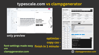
ClampGenerator vs Typescale.com - Best Font-Size & Typescale Tool Comparison
Compare ClampGenerator and Typescale.com to find out which tool is better for responsive font-size, fluid typescale, and modern web typography workflows.
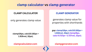
CSS Clamp Calculator vs Generator – What's the Real Difference?
Learn the key differences between a clamp calculator and a clamp generator in CSS. Discover when to use each tool for fluid typography, layout scaling, and responsive design.
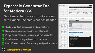
Typescale for Modern CSS – Responsive Fluid Design Without Media Queries
Learn how to build a modern CSS typescale using clamp() for responsive, fluid typography without relying on media queries. Discover the benefits of dynamic font scaling and the best generator tools.
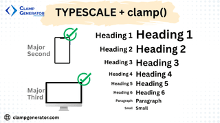
Clamp and Typescale For Fluid Typography
Learn how to combine clamp() and typescale for fluid typography. Optimize font scaling without media queries using ClampGenerator's smart presets and customization tools.
CSS Clamp Guide - How to use clamp() in Web Design
Learn how to use CSS clamp() to create fluid typography, and layout without media queries. This guide explains css syntax, use cases with examples.
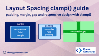
Layout Spacing Clamp Guide - Responsive Padding, Margin, and Gaps
Master CSS clamp() for layout spacing. Learn how to use clamp for responsive padding, margin, and grid gaps with real use cases and examples.
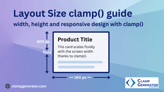
Layout Size Clamp Guide: Width, Height, and Responsive Design with clamp()
Master CSS layout sizing with clamp(). Learn to create fluid, responsive width and height properties using ClampGenerator for cards, containers, sections, and more—without media queries.