
Introduction
Spacing is just as important as size when designing responsive layouts. From paddings inside containers to margins between cards — spacing contributes to structure, readability, and visual rhythm.
This guide will help you:
- Use
clamp()for responsive padding, margin, and gap values. - Learn the difference between shorthand and directional properties.
- Generate clean, flexible CSS with a single line of code.
Check out the clamp() guide for layout size css properties like width, and height.
📦 Why Use clamp() for Spacing?
Spacing properties often require fine-tuning across screen sizes. Instead of relying on media queries, clamp() lets you:
- Set dynamic spacing that adapts fluidly from mobile to desktop.
- Prevent spacing from becoming too tight or too loose.
- Maintain vertical rhythm and content readability.
Perfect for:
- Section padding and container margin
- Grid/Flexbox gaps
- Responsive whitespace for cards, articles, or modals
Padding with clamp()
The padding property defines internal spacing for an element. Our tool with dedicated padding property automatically generates responsive clamp() values for all padding sides using shorthand optimization — no media queries required.
How to Use:
- Select padding in the Layout Clamp Generator.
- Define min and max values (e.g.,
1rem → 2rem). - Choose a viewport range (e.g.,
320px → 1280px). - Define
minandmaxfor each side:padding-toppadding-rightpadding-bottompadding-left
- The tool calculates the optimal
clamp()value per side - Based on values, we auto-generate a:
- 1-value (all sides same)
- 2-value (top-bottom / left-right)
- 3-value or 4-value
paddingshorthand
You don’t need to manage this manually — the output is always CSS-standard and optimized.
✅ Example Output 1 - All Sides Equal
padding: clamp(16px, calc(10.667px + 1.667vw), 32px);Use Case - Uniform Responsive Padding:
<div style="background:rgb(140, 245, 172);">
  <p>This block uses equal padding on all sides that scales with viewport height.</p>
</div>
The above html creates responsive padding starts from 16px on narrow mobile screen and max 32px on wide screen. Below is the live container, where adjust the screen size to check the fluid container padding.
Live preview of the above html
This block uses equal padding on all sides that scales with viewport height.
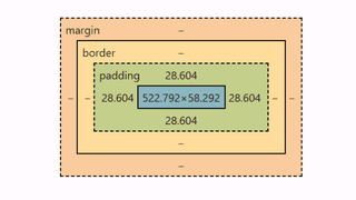
As a result, the padding for the ‘paragraph’ element is 28.60px at a screen width of 1074px (below image). Adjusting the screen size will dynamically increase or decrease the padding accordingly.
If you want full control on all sides, you can vary with shorthands.
✅ Example Output 2 - 2-Value Shorthand (Auto)
padding: clamp(16px, calc(10.667px + 1.667vw), 32px) clamp(8px, calc(0px + 2.5vw), 32px);Use Case - Responsive Vertical and Horizontal Padding:
<div style="padding: clamp(16px, calc(10.667px + 1.667vw), 32px) clamp(8px, calc(0px + 2.5vw), 32px); background:rgb(240, 229, 108);">
  <p>Vertical and horizontal padding automatically adapt based on input range.</p>
</div>
✅ Example Output 3 - 2-Value Shorthand (3 sides)
padding: clamp(16px, calc(10.667px + 1.667vw), 32px) clamp(8px, calc(0px + 2.5vw), 32px) clamp(8px, calc(0px + 2.5vw), 32px);Use Case - Asymmetric Padding Layout:
<div style="padding: clamp(16px, calc(10.667px + 1.667vw), 32px) clamp(8px, calc(0px + 2.5vw), 32px) clamp(8px, calc(0px + 2.5vw), 32px); background: #f1f5f9;">
  <p>This block uses custom responsive padding per side with shorthand format.</p>
</div>
🔁 Logical Properties (Auto Option in Custom Clamp Tool)
Use padding-inline and padding-block when targeting:
- LTR/RTL language support
- Vertical rhythm alignment
padding-inline: clamp(16px, 2.5vw, 36px);
padding-block: clamp(10px, 2vw, 32px);
🧠 Pro Tips -
padding
- Combine with a font-size
clamp generatorfor a fluid layout system.clamp()supportsvw,vh,vmin,svh,cqw, and more — over 30 responsive units.- Use directional padding with
padding-left,padding-inline-start, orpadding-block-endwhen needed.
🧭 Modern Logical Properties for Padding
If you prefer modern CSS practices, our generator also supports logical directional padding using padding-inline (left/right) and padding-block (top/bottom). These properties make your layouts language- and writing-direction aware, ideal for internationalization and RTL/LTR support.
padding-inline clamp()
The padding-inline property controls the horizontal (start/end) spacing of an element — replacing padding-left and padding-right in a direction-aware way.
Instructions:
- Set min/max for
startandendsides - Define viewport and property range
- The tool auto-generates a
clamp()expression for each side
Generated Output:
padding-inline: clamp(16px, calc(10.667px + 1.667vw), 32px) clamp(8px, calc(0px + 2.5vw), 32px);Use Case - Fluid Inline Padding for Content Cards
<div style="padding-inline: clamp(16px, calc(10.667px + 1.667vw), 32px) clamp(8px, calc(0px + 2.5vw), 32px); background: #e0f2fe;">
    <p>This block adapts inline padding based on screen size, supporting both LTR and RTL layouts.</p>
</div>
Live preview of the above html
This block adapts inline padding based on screen size, supporting both LTR and RTL layouts from 1.875rem to 2.5rem.
padding-block with clamp()
The padding-block property adjusts the vertical (top/bottom) padding in a logical layout — perfect for headings, sections, and responsive spacing patterns.
Instructions:
- Set min/max for
topandbottom - Set your viewport (e.g. vw 320px - 1280px) and property ranges
- The tool generates fluid clamp values for both directions
Generated Output:
padding-block: clamp(16px, calc(10.667px + 1.667vw), 32px) clamp(8px, calc(2.667px + 1.667vw), 24px);💼 Use Case - Dynamic Section Padding
<section style="padding:30px; background:rgb(115, 193, 245);">
    <p style="padding-block: clamp(1.875rem, calc(1.648rem + 1.136vw), 2.5rem); background:rgb(240, 243, 87);">This section uses responsive top and bottom spacing based on the viewport from 1.875rem to 2.5rem</p>
</section>
Live preview of the above html
This section uses responsive top and bottom spacing based on the viewport from 1.875rem to 2.5rem
✅ Why use Logical Properties?
| Feature | padding | padding-inline / padding-block |
|---|---|---|
| Responsive Control | ✅ Supports clamp() | ✅ Supports clamp() |
| Direction-Aware | ❌ Manual | ✅ Auto LTR/RTL switching |
| Cleaner Shorthand | Mixed | ✅ Readable and semantically clear |
Margin with clamp()
The margin property controls the external spacing around elements. Using clamp() lets margins scale fluidly across different screen sizes without writing media queries. It’s ideal for vertical rhythm, content separation, and adaptive layout spacing.
🔧 How It Works:
- Set your viewport size range (e.g., 320px to 1280px)
- Choose min and max values for each side (
top,right,bottom,left) - The tool auto-generates the optimal CSS shorthand, whether it’s:
- 1-value (uniform margin)
- 2-value (top-bottom / left-right)
- 3- or 4-value margin
- Copy and paste the generated code directly into your layout
✅ Example Output 1 - Uniform Margin (1 clamp)
margin: clamp(1rem, calc(0.5rem + 2.5vw), 2.5rem);💼 Use Case - Consistent Section Spacing with margin
<section style="padding:20px; background:rgb(153, 247, 208);">
  <p style="margin: clamp(1rem, calc(0.5rem + 2.5vw), 2.5rem);background: #f8fafc;">This section stays centered with responsive outer spacing.</p>
</section>
Live preview of the above html
This ‘p’ element stays centered with responsive outer spacing of margin from 1 rem to 2.5rem.
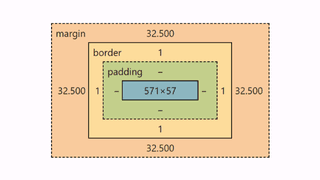
Below screenshot from chrome dev tools, computed layout spacing margin for the ‘p’ element is 32.50px for 980px screen width.
Similar to padding, for margin, you can customize the shorthands.
🔁 Logical Margin: margin-inline & margin-block
Using margin-inline and margin-block is recommended for modern layouts, RTL support, and semantic clarity.
margin-inline with clamp()
Generated Output:
margin-inline: clamp(1rem, calc(0.5rem + 2.5vw), 2.5rem) clamp(0.5rem, calc(0.167rem + 1.667vw), 1.5rem);💼 Use Case - Auto RTL/LTR Alignment
<div style="margin-inline: clamp(1rem, calc(0.5rem + 2.5vw), 2.5rem) clamp(0.5rem, calc(0.167rem + 1.667vw), 1.5rem); background: #e0f2fe;">
  <p>This content block supports logical horizontal margins for all languages.</p>
</div>
margin-block with clamp()
Generated Output:
margin-block: clamp(1.5rem, calc(1rem + 2.5vw), 3rem);💼 Use Case - Spacing Between Header and Footer
<section style="margin-block: clamp(1rem, calc(0.333rem + 3.333vw), 3rem) clamp(1.5rem, calc(1rem + 2.5vw), 3rem); background: #fef9c3;">
  <h2>Hero Section</h2>
  <p>This section adapts vertical spacing dynamically as screen size grows.</p>
</section>
🧠 Pro Tips for margin
- Use
margin: autofor centering along with clamp values for vertical spacing - Combine
clamp()margins withgapin Flexbox or Grid layouts for fully fluid layouts - Prefer
margin-inline/margin-blockfor language-aware and modern CSS
Gap with clamp() in Grid or Flex
The gap property defines the spacing between items in CSS Flexbox and Grid layouts. With clamp(), you can create fluid gaps that scale between a defined minimum and maximum range—without media queries.
Our clampgenerator lets you:
- Set different responsive values for row-gap and column-gap
- Choose from px, rem, or em output
- Automatically generate optimized shorthand output for
gap
🔧 How It Works:
- Select
gapas the layout property - Choose your viewport unit (e.g.,
vw,vh,svw, etc.) - Define:
- Select input unit px or rem
- Viewport size range (e.g., 320px - 1280px)
- Property size range (min and max values)
- Individual row and column gap values
- The tool generates shorthand
gap:output with twoclamp()values (row / column)
✅ Example Output:
gap: clamp(1rem, calc(0.333rem + 3.333vw), 3rem) clamp(1.5rem, calc(1rem + 2.5vw), 3rem);💼 Use Case - Responsive Grid Layout
Use fluid row and column gaps in a CSS Grid layout that adapts to different screen sizes.
<div style="display: grid; grid-template-columns: 1fr 1fr; gap: clamp(1rem, calc(0.333rem + 3.333vw), 3rem) clamp(1.5rem, calc(1rem + 2.5vw), 3rem); background: #f1f5f9;">
  <div style="background: #bae6fd; padding: 1rem;">Item A</div>
  <div style="background: #7dd3fc; padding: 1rem;">Item B</div>
</div>
Live preview of the above html
This layout uses responsive row and column gaps:
- Row gap: 16px to 48px
- Column gap: 24px to 48px
- Both scale fluidly based on the viewport width (320-1280px)
🧠 Pro Tips for gap
- Use
gapwithdisplay: gridordisplay: flex(inflex-wrap: wrapscenarios) - Combine with
clamp()margin or padding for perfect layout rhythm - Choose
remfor scalable design systems — we support output inpx,rem, andem - All clamp values are calculated based on your selected font size when using
rem
🧭 Tips for Using clamp() in Spacing
- Use
remunits for scalable spacing across browsers. - Always test padding and margin visually — too much or too little effects design flow.
- Combine directional spacing like
padding-inline,margin-block, or even custom shorthands. - Use
gapfor component spacing — it’s cleaner than setting individual margins.
🎯 Summary & Best Practices
- Use
clamp()for spacing that adapts across screen sizes. - Apply it to
padding,margin,gap, and shorthand properties. - Clean, responsive CSS without media queries.
- Boosts consistency, flexibility, and readability in all layouts.
👉 Try the Layout Spacing Clamp Generator now and simplify your responsive spacing workflow.