Overview
Clamp() and typescale are a powerful combination for creating responsive, fluid typography. When used together, they enable consistent font scaling across viewports — all without media queries.
In this guide, we’ll explore how to fine-tune your typescale system using modern CSS and how tools like ClampGenerator help you generate performant, customizable clamp values with ease. Check out the clamp() guide for more information about clamp usage in responsive design.
The Problem with most Fluid Typography Tools
If you’ve ever tried creating a responsive font system using clamp() in CSS, you’ve probably encountered a key limitation:
⚠️ You can’t truly control the typescale across different screen sizes.
Tools like Fluid Type Scale and Typescale are good starting points. They let you define a base font size and apply a modular scale. However, they fall short when it comes to:
- 🎚 Adjusting the typescale separately for min and max viewports
- 🧹 Matching the scale to different font-families and design systems
- 👀 Previewing and resetting each heading level visually
This results in:
- ❌ Oversized headings on small screens
- ❌ Tiny body text on large desktops
- ❌ Unbalanced visual hierarchy and poor readability
What is a Typescale?
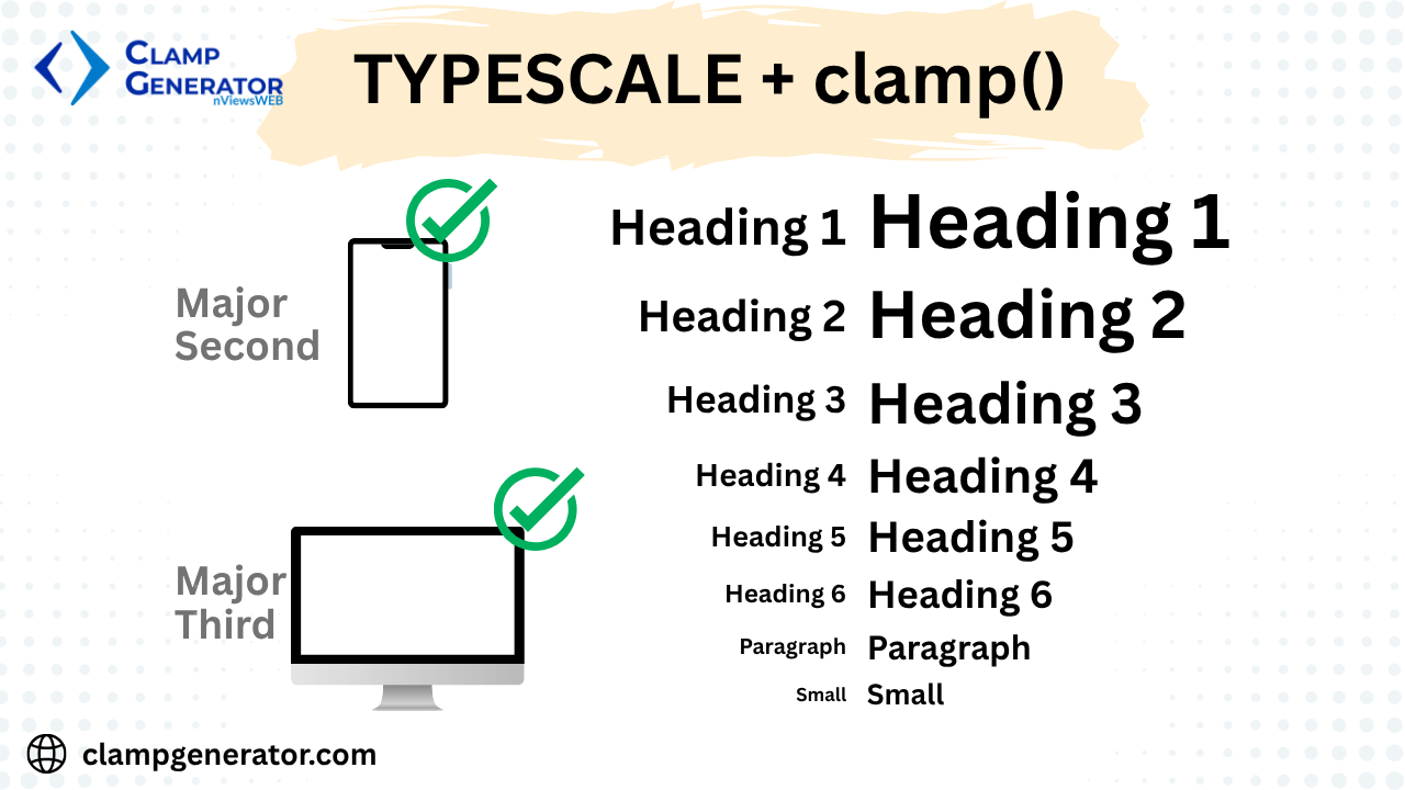
A typescale is a ratio-based system for defining font sizes — used to maintain consistent rhythm between headings, subheadings, body, and caption text. It helps create a visual hierarchy by growing each level relative to the base font size.
Common Typescales
- Minor Second (1.067)
- Major Second (1.125)
- Minor Third (1.2)
- Major Third (1.25)
- Perfect Fourth (1.333)
- Golden Ratio (1.618)
❌ There is no one-size-fits-all typescale.
Hence, we have introduced four new typescale multipliers based on real-time usage:
- Defaultmin
- defaultmax
- comfortablemin
- comfortablemax
To make it feel more native, we provide common typescale presets, while allowing you to customize the min and max typescale multipliers individually for each text element.
💡 Example
/* Base: 16px, Typescale: Default Min */
 h1{ font-size: 1.8rem }
 h2{ font-size: 1.5rem }
 h3{ font-size: 1.4rem }
 h4{ font-size: 1.3rem }
 h5{ font-size: 1.2rem }
 h6{ font-size: 1.10rem }
 base{ font-size: 1rem }
 small{ font-size: 0.875rem }
 tiny{ font-size: 0.75rem }
 code{ font-size: 0.875rem }
Why a Static Typescale Fails in Fluid Design
If you apply a single ratio across a range like 16px to 22px, it doesn’t adapt well. A scale of 1.25 might be ideal at 22px, but cramped at 16px.
📉 Static typescales don’t adapt to dynamic font sizing across viewports.
To build a fluid typography system, you need:
- Different typescale multipliers for min and max screen sizes
- Custom control over each heading and paragraph level
How to Use Clamp + Typescale for Responsive Typography
To build fluid, responsive typography:
- ✅ Define root font size (e.g.,
16px) - ✅ Set a viewport range (e.g.,
320pxto1200px) - ✅ Define font size range (e.g.,
16pxto20px) - ✅ Adjust typescale multipliers for each element
- ✅ Fine-tune:
h1-h6,p,small,caption
🔧 Use ClampGenerator to do this visually and generate responsive CSS without media queries.
Why ClampGenerator.com/tools/font-size-typescale is Different
Our tool is more than a generator — it’s a typescale optimizer:
- ✅ Set root font size, font limits, and viewport range
- ✅ Define different typescale multipliers for min and max viewports
- ✅ Preview and reset h1-h6, p, small, caption
- ✅ Customize fonts and utility prefix
- ✅ One-click CSS output with clamp formulas and utility classes
Features of clampgenerator’s font-size typescale
| Feature | Description |
|---|---|
| Root Font Size | Sets base rem unit (e.g., 16px = 1rem) |
| Viewport Range | Controls where scaling starts and ends |
| Base Font Size | Defines min and max font size |
| Typescale Multipliers | Separate values for min and max sizes |
| Heading Overrides | Reset h1-h6, p, small, caption individually |
| Font Styling | Set custom font-family and weight |
| Utility Prefix | Customize variable/class names |
| Copy Full CSS | Generate complete responsive styles |
Example Output
Settings:
- Root:
16px - Viewport:
320px → 1200px - Font:
16px → 20px - Typescale:
1.125(min),1.333(max)
html { font-size: 16px; }
:root {
  --fs-base: clamp(1rem, calc(0.89rem + 0.31vw), 1.25rem);
  --fs-h1: clamp(2rem, calc(1.95rem + 0.68vw), 2.75rem);
  --fs-h2: clamp(1.75rem, calc(1.66rem + 0.61vw), 2.3rem);
  ...
}
Getting Started with Clamp + Typescale
Follow these steps to create your fluid typography system using ClampGenerator:
- Open the Font Size Clamp Tool.
- Set your root font size (e.g., 16px).
- Define the min and max viewport widths for responsiveness.
- Enter min/max font sizes and select a typescale preset (e.g., Comfortable Min / Max).
- Preview and fine-tune each element:
h1–h6,p,code,small, andcaption. - Copy the generated CSS with utility class names and variables.
🎯 How to Optimize Your Typescale with the Tool
- Set root font and viewport range
- Choose base font size limits
- Set typescale multipliers
- Preview h1-h6, p, small, caption
- Adjust/reset elements
- Copy the full CSS output
Conclusion
A great fluid typography system needs more than clamp() — it needs smart typescale, fine customization, and full control.
With ClampGenerator.com:
- ✅ No media queries
- ✅ No hardcoded jumps
- ✅ No single-ratio constraints
👉 Try our (nviewsWEBs) Advanced Free Online & Offline Font Size - Typescale Clamp Tool
🔗 This guide is part of our Clamp Generator Guides.
Explore additional tools for layout spacing and CSS clamp basics.
💬 Have feedback? We’d love to hear from you!
