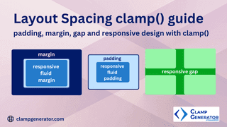
Gap in CSS Layouts
Control spacing in Grid and Flexbox layouts using clamp().
Start exploring clamp() generator & tools to enhance your responsive design workflow!
Control spacing in Grid and Flexbox layouts using clamp().
Start exploring clamp() generator & tools to enhance your responsive design workflow!