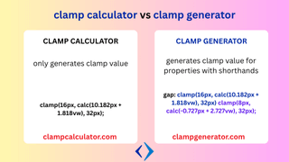
When you’re building responsive designs with clamp() in CSS, you might come across two popular terms: Clamp Calculator and Clamp Generator. At first glance, they might seem interchangeable—but they serve slightly different purposes, especially when precision and project scale come into play.
In this article, we’ll break down the key differences, use cases, and benefits of both tools to help you choose the right one for your workflow.
What is a CSS clamp calculator?
To get into the clamp calculator, we need to know what clamp() is? The purpose of clamp() in CSS is to set the fluid value between minimum and maximum size. It is good to know how to use clamp() for web design.
A clamp calculator is a simple tool that helps you generate a basic clamp() value using the formula for the minimum value, maximum value and viewport range.
When we calculate the viewport area manually, it is quite difficult to calculate the slope, intercept and merge to create a linear area based on the viewport and set the minimum and maximum value.
The clamp calculator makes it easy for you with the min and max and viewport min and max inputs.
Use it when:
- You already know your min/max values.
- You just need a quick formula.
- You are working on a small component or an inline style.
Example output:
css clamp(1rem, calc(0.5rem + 2.5vw), 2rem);
And finally, with the above output, you can expect the clamp to work for the minimum value of 1 rem and the maximum value of 2 rem for the viewport range of 320 px to 960px.
A simple tool to create a clamp value based on the input. You can use it anywhere.
What is a CSS Clamp Generator?
A Clamp Generator is a more advanced utility. It not only calculates clamp() values, but also:
- Handles multiple properties (e.g., font-size, padding, margin, gap, width).
- Allows shorthand logic and direction-aware properties.
- Offers live preview and full responsive output.
- Supports advanced scenarios like fluid typescale systems.
Think of it as your design system builder—not just a quick calculator.
Use it when:
- You’re designing typography systems with multiple breakpoints.
- You want to visualize your layout scaling.
- You need dynamic control over spacing, sizing, and fluid responsiveness.
Clamp Calculator vs Clamp Generator — Quick Comparison
| Feature | Clamp Calculator | Clamp Generator |
|---|---|---|
| 🔢 Input | Simple min/max + viewport | Full property system |
| 📏 Output | One-line formula | Full responsive CSS block |
| 🎨 Live Preview | Rare | Often included |
| 🧩 Use Case | Single value utility | Full UI scale or spacing logic |
| 🧑💻 Ideal For | Developers tweaking styles | Designers + developers building scalable UIs |
Internal Links to Explore More
- Simple clampcalculator tool
- Font-size Clamp Generator Tool
- Layout Clamp Generator Tool
- CSS Clamp Guide
Final Thoughts
If you’re just getting started or need a fast answer, a Clamp Calculator is your go-to tool. But if you’re building a design system or scaling styles across devices, a Clamp Generator is the powerhouse you need.
Both are essential tools in a modern CSS workflow—use them together wisely.
