Designing modern websites means going beyond breakpoints. Today, responsive typography isn’t just about resizing text at fixed media query steps. It’s about scaling smoothly, adapting to any screen width — without writing extra CSS.
That’s where a typescale and clamp() come into play.
🔤 What is a Typescale in Web Design?
A typescale is a consistent progression of font sizes — typically based on a mathematical ratio — applied across elements like headings, body text, captions, and UI labels. This scaling system ensures a harmonious visual rhythm and typographic hierarchy, making your design feel cohesive and easier to read.
For example, starting with a base font size of 1rem, a custom typescale might look like:
/* Example: Custom typescale ratio for a real-world UI */
h1 { font-size: 1.8rem; }
h2 { font-size: 1.5rem; }
h3 { font-size: 1.4rem; }
h4 { font-size: 1.3rem; }
h5 { font-size: 1.2rem; }
h6 { font-size: 1.1rem; }
body { font-size: 1rem; }
These ratios aren’t fixed. Designers often choose from a range of musical or natural progression ratios depending on the design intent:
| Ratio Name | Multiplier |
|---|---|
| Minor Second | 1.067 |
| Major Second | 1.125 |
| Minor Third | 1.200 |
| Major Third | 1.250 |
| Perfect Fourth | 1.333 |
| Augmented Fourth | 1.414 |
| Perfect Fifth | 1.500 |
| Golden Ratio (φ) | 1.618 |
These ratios can be used to build modular scales either statically (with rem) or responsively with clamp().
👉 Try it live with the Font-size Typescale Generator Tool
What is a Modern Typescale?
A modern typescale uses the CSS clamp() function to fluidly scale typography based on the viewport width. Unlike a static rem-only typescale that simply sets visual hierarchy, a modern typescale ensures that hierarchy adapts fluidly across screen sizes — all without media queries or breakpoints.
This means your headers and body text can grow proportionally from small mobile screens to large desktop layouts, preserving both readability and rhythm.
Example of a Modern Typescale Using clamp():
h1, .cg-h1 {
  font-size: clamp(1.80rem, calc(1.636rem \+ 0.818vw), 2.25rem);
}
h2, .cg-h2 {
  font-size: clamp(1.50rem, calc(1.364rem \+ 0.682vw), 1.88rem);
}
h3, .cg-h3 {
  font-size: clamp(1.40rem, calc(1.273rem \+ 0.636vw), 1.75rem);
}
h4, .cg-h4 {
  font-size: clamp(1.30rem, calc(1.182rem \+ 0.591vw), 1.63rem);
}
h5, .cg-h5 {
  font-size: clamp(1.20rem, calc(1.091rem \+ 0.545vw), 1.50rem);
}
h6, .cg-h6 {
  font-size: clamp(1.10rem, calc(1.000rem \+ 0.500vw), 1.38rem);
}
body, .cg-base {
  font-size: clamp(1.00rem, calc(0.909rem \+ 0.455vw), 1.25rem);
}
These values smoothly interpolate between a minimum, a preferred value (with slope), and a maximum, delivering consistent scaling across devices.
Why It Matters:
- ✅ No need for
@mediaqueries - ✅ Preserves modular scale and rhythm
- ✅ Adapts to fluid and container-based layouts
- ✅ Modern browser support
👉 Learn how this works under the hood in our CSS Clamp Guide and how to use in web-design
👉 Want to try it out? Use our Font-size Clamp Generator
What is a Typescale Generator?
A typescale generator is a design-to-code tool that helps you build a harmonious set of font sizes across your web project — from headings (h1–h6) to body text and UI elements.
What does a Typescale Generator Do?
It allows you to:
- Define a base font size (e.g., 1rem or 16px)
- Choose a scale ratio (like 1.25, 1.33, or even the golden ratio 1.618)
- Generate consistent font sizes for heading levels and body text
- Optionally output fluid
clamp()values that respond to screen width - Export styles in CSS, SCSS, or Tailwind-friendly formats
Types of Typescale Generators
Static typescale tools
Focus on visual scaling with fixed rem/px output. Best for design exploration.
Examples: Typescale.com, Typescale.io, Typescale.net.
Responsive clamp() generators
Provide dynamic scaling output using modern CSS like clamp().
Examples: ClampGenerator.com, Utopia.fyi, Fluid Type Scale
Why Use a Typescale Generator?
- Maintain consistent visual rhythm
- Avoid arbitrary font sizes
- Speed up development with ready-to-use CSS
- Support responsive design without breakpoints
👉 Want full control and modern responsive output? Try our Typescale Clamp calculator
Best Typescale Generator Tool for Modern CSS
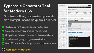
When it comes to building a fluid, responsive typescale using modern CSS, ClampGenerator.com leads the way. It offers full control over how your typography scales across devices — without the hassle of media queries.
Why ClampGenerator Stands Out?
ClampGenerator allows you to:
✅ Define min/max font sizes and scale multipliers
✅ Customize each element — h1 through h6, base, code, small, etc.
✅ Preview fluid scaling live with a simulated responsive viewport
✅ Export ready-to-use CSS, Tailwind, SCSS, or custom variables
✅ Works offline, no sign-in, perfect for privacy-focused workflows
👉 Compare: ClampGenerator vs Typescale.com
Why Use clamp() Instead of Media Queries?
Modern CSS with clamp() provides a cleaner, more fluid typography system:
- ✅ Eliminate repetitive
@mediaqueries - ✅ Avoid clunky font jumps between breakpoints
- ✅ Ensure smooth scaling across screen sizes
- ✅ Maintain visual hierarchy and rhythm naturally
- ✅ Save development time and CSS size
Want to build a layout that scales too? Try our Layout Clamp Generator Tool for responsive spacing, margin, and padding with clamp().
Summary: Clamp vs Traditional Typescale
| Concept | Traditional Typescale | Modern Clamp Typescale |
|---|---|---|
| Font Size Growth | Static rem values | Fluid clamp() + vw |
| Breakpoints Required | ✅ Yes | ❌ No |
| Media Queries | Required | Not needed |
| Responsiveness | Step-based scaling | Smooth, fluid scaling |
| Output | rem, px | clamp() expression |
| Developer Control | Limited | Full customization |
If you’re serious about modern, responsive typography — ClampGenerator gives you the precision and flexibility needed for production-ready code.
