CSS clamp() Generator
For Fluid Typography & Responsive Layouts
Create fluid font sizes & layouts with precision. Trusted by designers & developers.
Generate responsive clamp() CSS — instantly. No guesswork.
Design fluidly. Scale beautifully.
Built for developers and designers who want clean, flexible CSS without manual slope & intercept calcualtion.
All You Need is Viewport Range and Desired Size?
Whether it's font-size, margin, width, or padding — every responsive clamp() value is calculated using just these:
These four inputs are all you need to create fluid CSS values using the clamp() function for **any property**. For this purpose simple our ClampCalculator will help you to generate just clamp values.
Simple clamp() value is not enough to build best fluid responsive web design. Don't worry, we have developed advanced free tools to generate clamp() for different css properties like font-size, layout, etc.
Check out how clamp calculator different from clamp generator.
ClampGenerator.com — Built for Practical Design & Development
Everything you need to build clean, scalable, responsive CSS for modern projects — no more hacks or guesswork.
✅ Dedicated tool for each properties
- Option to customize for each property independently
- Viewport selection
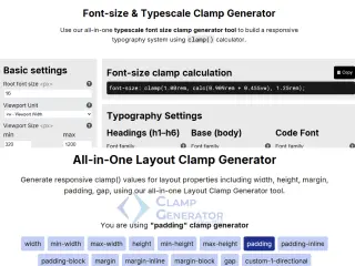
✅ Font Size & Typescale
- Typescale support & optimization
- font-family, font-weight support
✅ Modern css clamp generation
- Output in clean css, variables, tailwind, SCSS
- Preview, optimize & 1-click copy
✅ Layout Spacing
- Padding, Margin, Gap support
- rem output & Shorthand support
✅ Up-to-Date CSS with Best Practices
- Powered by React for instant output
- docs, guides, and articles to excel in clamp.
How We Generate clamp() Value for Responsive Design
Whether you're styling font sizes, layout spacing, or widths, our generator uses a proven math-based formula to produce highly accurate and flexible clamp() CSS values — no manual slope or intercept calculation required.
Math behind clamp value
Inputs you provide:
- Min Viewport:
320px - Max Viewport:
1200px - Min Size:
1remor16px - Max Size:
2remor32px
We calculate:
slope = (maxSize - minSize) / (maxViewport - minViewport)
intercept = -(minViewport x slope) + minSize
clamp(minSize, calc(intercept + slope x 100vw), maxSize)
Font Size Example
Imagine you want your font size to scale from 1rem to 3rem between 320px and 1200px viewport width.
font-size: clamp(1.00rem, calc(0.273rem + 3.636vw), 3.00rem);Same extended to typescale, to setup and shine in typography settings.

Padding or Layout Clamp Example

Let's say your padding should scale from 10px to 30px as viewport changes from 320px to 1200px.
padding: clamp( 10px, calc( 2.727px + 2.273vw), 30px );Why it Works Perfectly Every Time
- We abstract the complex math
- Real-time JavaScript calculation
- Precision values for pixel-perfect layouts
- plain css, variables, tailwind support
- Works with
px,rem, orem - Live preview and instant output
Among the many CSS clamp calculators & generators available online, we are the best clamp generator offers unique facilities like online, offline, advanced features for typescale tuning, layout spacing, layout size and is crafted to suit both beginners and advanced developers with practical guides, production-ready outputs.
Ready to Scale Responsively?
Built for designers and developers who care about perfect scaling.