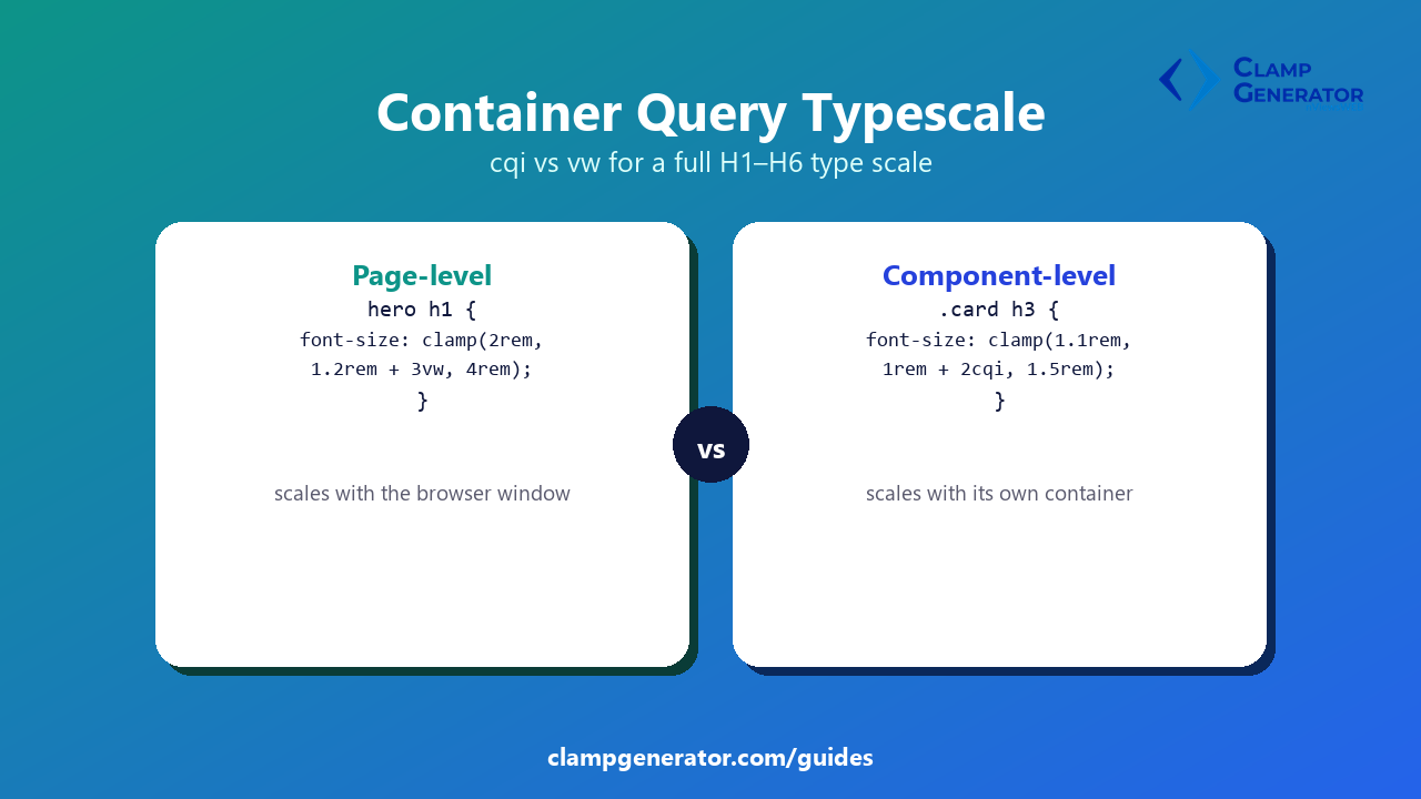
Short answer: a vw-based type scale assumes every element using it spans roughly the same share of the browser window. The moment you reuse that same scale inside a sidebar, a modal, or a card in a 3-column grid, vw scales it against the wrong number — the whole window, not the space it actually has. Container query units (cqi, cqw) fix that by scaling against the containing element instead.
When vw is the right choice
If the type scale belongs to the page layout itself — a hero H1, a full-width article’s body copy — vw is correct and simpler. The element genuinely does span (close to) the full viewport, so scaling against the viewport is the right model.
.hero h1 {
  font-size: clamp(2rem, 1.2rem + 3vw, 4rem);
}
When cqi is the right choice
A testimonial card, a product card inside a grid, or any component that might get embedded somewhere narrower than the full page doesn’t have “the viewport” as a meaningful reference — it has whatever width its container gives it. Swap vw for cqi and give the element a sized ancestor:
.card {
  container-type: inline-size;
}
.card h3 {
  font-size: clamp(1.1rem, 1rem + 2cqi, 1.5rem);
}
Now the same card’s heading scales correctly whether that card sits in a single-column mobile layout or a 4-column desktop grid — because it’s reading its own container’s width, not the browser window’s.
The same type scale, both ways
Say your H1-H6 scale uses a 1.25 ratio with the same rem bounds either way — only the fluid middle argument changes:
/* page-level: scales with the viewport */
h2 { font-size: clamp(1.5rem, 1.3rem + 1vw, 2.25rem); }

/* component-level: scales with the container */
.widget h2 { font-size: clamp(1.5rem, 1.3rem + 1cqi, 2.25rem); }
Everything about the scale — ratio, min, max — stays identical. Only the unit driving the middle term changes, because it’s answering a different question: “how wide is the browser” vs. “how wide is my container.”
Mixing both in the same page
Nothing stops a page-level H1 from using vw while a card component nested further down the same page uses cqi — they’re independent decisions per component, not a site-wide setting.
One prerequisite: declare the container
cqi resolves to nothing without an ancestor explicitly opted in:
.card { container-type: inline-size; }Skip this and the browser has no container to measure, so the cqi-based sizes collapse instead of scaling. If a container-based heading isn’t scaling at all, this is the first thing to check.
Building a component-level type scale?
Generate the full H1-H6 scale with the Fluid Typescale Clamp Generator, then switch the viewport unit to a container query unit for any element that needs to scale by its container instead of the page.