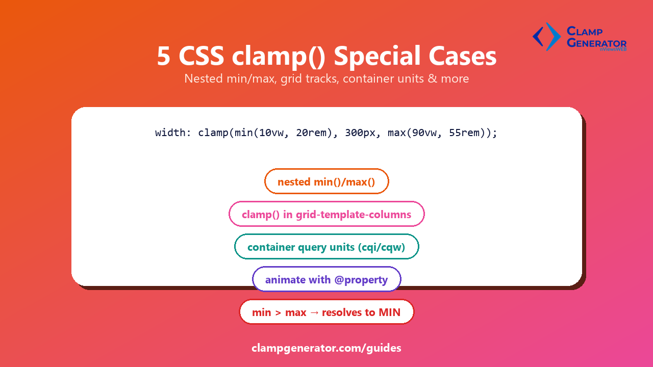
Five clamp() situations that go beyond the basic clamp(min, preferred, max) pattern, each with a direct example.
1. Nesting min() and max() inside clamp()
Each of clamp()’s three arguments can itself be a min() or max() expression — useful when one bound needs its own condition instead of a fixed number.
width: clamp(min(10vw, 20rem), 300px, max(90vw, 55rem));Here the floor is “whichever is smaller: 10% of the viewport, or 20rem” — so the minimum itself shrinks on very narrow screens instead of staying fixed.
2. clamp() inside grid-template-columns
Wrap it in minmax() to get fluid, auto-wrapping grid tracks with no media query:
.cards {
  display: grid;
  grid-template-columns: repeat(auto-fit, minmax(clamp(150px, 30vw, 250px), 1fr));
  gap: clamp(0.75rem, 2vw, 1.5rem);
}
Each track scales fluidly between 150px and 250px, and the grid still wraps columns automatically as space runs out.
3. Using container query units instead of viewport units
A plain vw-based clamp() scales with the browser window — wrong for a component that might render inside a narrow sidebar or a wide main column. Swap vw for a container query unit (cqw, cqi) and the same clamp() scales with its container instead:
.card {
  container-type: inline-size;
}
.card h2 {
  font-size: clamp(1.1rem, 4cqi, 1.6rem);
}
The heading now scales with the card’s own width, correctly, wherever that card is placed.
4. Animating a clamp()-driven custom property
A clamp() value assigned to a custom property (--size: clamp(...)) can’t be transitioned by default — browsers treat custom properties as untyped strings, and you can’t interpolate between two strings. Register the property first:
@property --size {
  syntax: "<length>";
  inherits: true;
  initial-value: 1rem;
}
.box {
  --size: clamp(1rem, 5vw, 3rem);
  width: var(--size);
  transition: --size 0.3s ease;
}
With the @property registration in place, the browser knows --size is a <length> and can animate it smoothly instead of jumping instantly.
5. When min is greater than max
clamp(MIN, VAL, MAX) is a formula — max(MIN, min(VAL, MAX)) — not a validity check. If MIN ends up larger than MAX (easy to do by accident with a calculated custom property), there’s no error: the result is always MIN.
/* if --min ever computes larger than --max, this silently returns --min */
width: clamp(var(--min), 50vw, var(--max));
Compare that to PHP’s native clamp(), which throws a ValueError in the same situation — see PHP clamp() vs CSS clamp(): what’s the difference for the full comparison.