If you’ve ever googled “how to make font-size responsive without media queries”, you’ve already run into the magic of clamp().
This powerful CSS function lets you define minimum, preferred, and maximum values — giving you fluid, scalable typography without needing complex media queries.
To make the most of clamp(), you’ll need a good tool — and there are several great (and free) options out there. In this post, we’ll compare the best font-size clamp generators, highlight their strengths and limitations, and explain why ClampGenerator.com’s Font Size Clamp Generator stands out.
🧠 Want to understand the difference between a clamp calculator and a clamp generator? Check out CSS Clamp Calculator vs Generator for a deeper breakdown.
🏆ClampGenerator.com - Best Font Size Clamp Generator
If you’re looking for the most comprehensive and flexible font-size clamp generator, ClampGenerator.com by nviewsWEB is the clear winner. Whether you’re a beginner or a frontend pro, this tool gives you the power and precision you need to build a scalable typography system — without writing a single line of clamp logic manually.
🚀 Key Features in font-size Clampgenertor.com tool
- Base font-size setup (e.g., 16px, 18px)
- Viewport units:
vw,vi,cqi, and more - Viewport range: Define min and max widths
- Element-specific control for:
h1-h6,p,code,small,tiny
- Typescale multiplier per element
- Font family + weight selector for headings, base, and code
- Live responsive preview that simulates screen resizing
- Output formats: plain CSS, CSS variables, Tailwind utility classes, SCSS
- Works online and offline
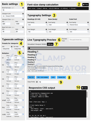
Above image briefly explains how to use our font-size clamp generator tool in step-by-step approach to generate css clamp() for font settings.
🧪 Example CSS Output
This is an actual block of plain CSS you can copy and paste into your project — no tweaks needed:
css
/*
* Generated by clampgenerator.com
* Font size: 16px to 20px
* Viewport: 320vw to 1200vw
*/
html { font-size: 16px; }

/* Font Family Setup */
body {
font-family: 'Inter', sans-serif;
font-weight: 400;
}

h1, h2, h3, h4, h5, h6 {
font-family: 'Inter', sans-serif;
font-weight: 700;
}

code {
font-family: 'Roboto Mono', monospace;
font-weight: 400;
}

/* Typography Sizes */
h1, .cg-h1 {
font-size: clamp(1.80rem, calc(1.636rem + 0.818vw), 2.25rem);
}
h2, .cg-h2 {
font-size: clamp(1.50rem, calc(1.364rem + 0.682vw), 1.88rem);
}
h3, .cg-h3 {
font-size: clamp(1.40rem, calc(1.273rem + 0.636vw), 1.75rem);
}
h4, .cg-h4 {
font-size: clamp(1.30rem, calc(1.182rem + 0.591vw), 1.63rem);
}
h5, .cg-h5 {
font-size: clamp(1.20rem, calc(1.091rem + 0.545vw), 1.50rem);
}
h6, .cg-h6 {
font-size: clamp(1.10rem, calc(1.000rem + 0.500vw), 1.38rem);
}
body, .cg-base {
font-size: clamp(1.00rem, calc(0.909rem + 0.455vw), 1.25rem);
}
small, .cg-small {
font-size: clamp(0.88rem, calc(0.795rem + 0.398vw), 1.09rem);
}
.tiny, .cg-tiny {
font-size: clamp(0.75rem, calc(0.682rem + 0.341vw), 0.94rem);
}
code, .cg-code {
font-size: clamp(0.88rem, calc(0.795rem + 0.398vw), 1.09rem);
}
📌 Verdict
ClampGenerator.com is the most balanced and advanced free font-size clamp generator available today. It offers the perfect blend of flexibility, precision, and ease of use — making it ideal for both quick one-off setups and full-blown design systems.
Whether you’re building with plain CSS or scaling across Tailwind or SCSS — this tool belongs in your workflow.
Fluid Type Scale - Font-Size Clamp Calculator
Fluid Type Scale, developed by Aleksandr, is a solid tool for generating fluid font-size values using clamp() — with a focus on full typescale support.
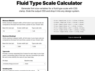
You can define min/max font sizes for various scale steps (like sm, base, md, lg, etc.), and the tool generates CSS variables you can drop directly into your stylesheets. It even allows setting custom prefixes and selectors, which is great for design systems and scalable CSS setups.
--fs-sm: clamp(0.8rem, 0.17vi + 0.76rem, 0.89rem);
--fs-base: clamp(1rem, 0.34vi + 0.91rem, 1.19rem);
--fs-lg: clamp(1.56rem, 1vi + 1.31rem, 2.11rem);| Pros | Cons |
|---|---|
| Outputs clean CSS variables | No direct element control (e.g., H1-H6, p) |
| Supports typescale setup for min and max viewport | You cannot customize multipliers per element |
| Custom prefix and selector options | Uses vi unit (viewport inline), which may behave unexpectedly in non-LTR layouts or writing modes |
| Visual preview panel for font scaling | No tailwind css support, plain css support. |
| No font-family, font-weight setup |
⚠️ Tip: Always test in different writing modes and layouts before using vi in production. It’s not always a drop-in replacement for vw.
Verdict
Best suited for design-system-focused font sizing, especially if you prefer working with CSS variables and modular scale steps. Just be mindful of vi unit behavior — it’s powerful but not universally safe.
Utopia.fyi - Fluid Clamp Calculator for Typography
Utopia.fyi, created by James Gilyead and Trys Mudford, is more than a font-size clamp calculator — it’s a complete toolkit for designing fluid typography systems using typescale principles across min and max viewport sizes.
The intuitive UI offers responsive previews, visual step charts, and clamp value breakdowns, making it easy to grasp how values adapt across screens. However, for beginners, it can feel a bit advanced right out of the gate.
Rather than outputting direct CSS for HTML elements like h1-h6, it generates root-level variables for you to plug into your stylesheet:
:root {
  --step--1: clamp(0.9375rem, 0.9158rem + 0.1087vw, 1rem);
  --step-0: clamp(1.125rem, 1.0815rem + 0.2174vw, 1.25rem);
  --step-1: clamp(1.35rem, 1.2761rem + 0.3696vw, 1.5625rem);
  --step-2: clamp(1.62rem, 1.5041rem + 0.5793vw, 1.9531rem);
}
Pros & ❌ Cons
| ✅ Pros | ❌ Cons |
|---|---|
| Visual interface with clamp previews, tables, and scaling charts | No direct output for HTML elements like h1-h6, p, etc. |
| Outputs in CSS, SCSS, and PostCSS formats | No Tailwind utility class support |
| Flexible scaling with step-based definitions | No font-family or font-weight configuration |
| Ideal for creating consistent design systems | No per-element typescale adjustments |
| Requires manual setup for real-world integration |
🔎 Want to use these for headings? You’ll need to manually map each --step-x variable to the relevant tag.
📌 Verdict
Utopia.fyi is a powerhouse for teams and pros working with design tokens and global CSS variables. While it’s not the fastest option for quick clamp values, it shines when you need scalable, systematic control over responsive typography.
FluidTypography.com
FluidTypography.com is a lightweight tool focused on generating clamp() values for font-size — and optionally line-height. It offers simple visual previews to help you understand how type scales between a minimum and maximum viewport.
However, while the font-size output is solid, the line-height clamp values often require adjustment to match real-world design needs. There’s no built-in typescale logic, and it doesn’t support element mapping, font customization, or output in frameworks like Tailwind or SCSS.
Here’s a typical output when scaling from 16px to 48px over a 320px-1200px viewport:
font-size: clamp(1rem, 3.636vw + 0.273rem, 3rem);
line-height: clamp(1.5rem, 5.455vw + 0.409rem, 4.5rem);
✅ Pros & ❌ Cons
| ✅ Pros | ❌ Cons |
|---|---|
| Quick clamp generation with live preview | No typescale or element-level support |
| Includes optional line-height calculation | Line-height output often needs manual refinement |
| Easy to use for simple scaling | No support for font-family or font-weight configuration |
| No CSS variable, SCSS, or Tailwind output options |
📌 Verdict
FluidTypography.com is great for fast, one-off font-size clamps. But if you’re building a full typescale or want precision control over typography, you’ll quickly run into its limitations.
Font Size Clamp Generator Comparison Table
| Tool Name | ClampGenerator.com | Fluid Type Scale | Utopia.fyi | FluidTypography.com |
|---|---|---|---|---|
| Font-size Clamp | ✅ Yes | ✅ Yes | ✅ Yes | ✅ Yes |
| Line-height Clamp | ❌ Coming Soon | ❌ No | ❌ No | ✅ Basic |
| Typescale Control | ✅ Per Element | ⚠️ Single scale only | ✅ Multi-step | ❌ No |
| Element Mapping (h1–h6) | ✅ Full Support | ❌ No | ❌ No | ❌ No |
| CSS Variables | ✅ Yes | ✅ Yes | ✅ Yes | ❌ No |
| Tailwind Output | ✅ Yes | ❌ No | ❌ No | ❌ No |
| Font Family/Weight | ✅ Yes | ❌ No | ❌ No | ❌ No |
| Live Preview | ✅ Yes | ✅ Yes | ✅ Yes | ✅ Yes |
| Verdict | ⭐ Most complete free tool | Great for design systems using variables | Ideal for pro teams & SCSS/PostCSS | Good for quick preview-only use |
Legend
- Element Mapping = direct output like
h1,p,small, etc. - Typescale Control = ability to define multipliers per element or step
- Live Preview = ability to simulate screen resizing or view scaling
- Font Family/Weight = setup option for body and heading typography
Looking for a Visual-First Typescale Alternative?
Every tool above generates clamp() output for real production CSS. If you’re coming from a more visual, design-preview tool like Typescale.com and want to see how it stacks up against a clamp()-based workflow, read our full ClampGenerator vs Typescale.com comparison — it breaks down exactly why ClampGenerator is the better Typescale.com alternative once you’re ready to ship code.