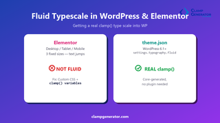
Short answer: neither Elementor’s typography panel nor the classic WordPress customizer produces a real fluid type scale on their own — Elementor jumps between 3 fixed breakpoints, and the classic customizer has no concept of clamp() at all. You get genuine fluid scaling in WordPress either by pasting generated clamp() CSS into Elementor’s Custom CSS, or natively in a block theme via theme.json’s fluid typography setting (WordPress 6.1+).
Why Elementor’s “responsive” typography isn’t fluid
Elementor’s typography control lets you set a different font size for Desktop, Tablet, and Mobile. That’s still just three fixed values — text snaps from one to the next at Elementor’s breakpoints, instead of scaling continuously the way clamp() does. On the handful of pixels right around a breakpoint, you still get a visible jump.
Adding a real fluid type scale to Elementor
- Generate your scale with the Font Size & Typescale Clamp Generator — set your min/max base size and viewport range, pick H1-H6 multipliers, and copy the CSS Variable output.
- In Elementor, go to Site Settings → Custom CSS (or Theme Builder → Custom CSS for a template-specific override) and paste the generated custom properties, e.g.:
:root {
  --h1-size: clamp(1.75rem, 1.2rem + 2.5vw, 3rem);
  --h2-size: clamp(1.5rem, 1.1rem + 1.8vw, 2.25rem);
  --body-size: clamp(1rem, 0.95rem + 0.3vw, 1.125rem);
}- For each heading or text widget, open Advanced → Custom CSS and reference the variable instead of a fixed size:
selector h1, selector .elementor-heading-title {
  font-size: var(--h1-size);
}
Because the custom properties live in :root, every widget referencing them scales together — change the scale once, update everywhere.
Adding it natively with theme.json (block themes)
If the site runs a block theme (or a classic theme that still registers theme.json), WordPress core can generate the clamp() for you — no plugin, no custom CSS. Since WordPress 6.1, setting settings.typography.fluid to true turns on fluid sizing for your preset font sizes:
{
  "settings": {
    "typography": {
      "fluid": true,
      "fontSizes": [
        {
          "name": "Large",
          "slug": "large",
          "size": "1.5rem",
          "fluid": { "min": "1.25rem", "max": "2rem" }
        }
      ]
    }
  }
}
With an explicit fluid.min/fluid.max object, WordPress resolves that preset to a real clamp(1.25rem, …, 2rem) using size as the preferred value. Omit min/max and WordPress calculates them for you. Set "fluid": false on an individual preset to opt it back out of fluid sizing while the rest of the scale stays fluid.
One caveat worth knowing before you rely on it: equal min and max viewport widths have triggered a division-by-zero error in some WordPress versions, since a flat viewport range isn’t actually “fluid.” Keep a real spread between your min and max viewport. (Source: WordPress 6.1 fluid font sizes developer note.)
Which approach should you use?
- Elementor site, no block theme: generate the scale here and paste it into Custom CSS — this is the only path available to you.
- Block theme, want full control over the ratio/viewport range: still generate the scale here and set explicit
fluid.min/fluid.maxper preset — WordPress’s own auto-calculation doesn’t let you pick a modular scale ratio or preview the result before publishing. - Block theme, happy with WordPress’s defaults:
settings.typography.fluid: truealone is the fastest path, with no custom CSS at all.
Want the full H1-H6 scale generated for you?
Set your base size, viewport range, and ratio once in the Font Size & Typescale Clamp Generator, and copy the CSS Variable, SCSS, or Tailwind output straight into Elementor or your theme.json.