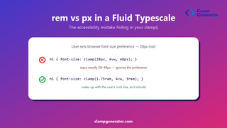
Short answer: if your type scale’s clamp() bounds are in px, they silently ignore any user who has changed their browser’s default font-size preference. Use rem for the min and max instead — it’s the same visual result for everyone at the default setting, and it actually responds for everyone else.
What breaks, specifically
A browser’s font-size preference (not the same as page zoom) changes the root font size — the value 1rem resolves against — away from the 16px default. Someone with low vision might set it to 20px or 24px once, site-wide, and never touch it again.
/* px bounds: ignore the user's font-size preference completely */
h1 { font-size: clamp(28px, 4vw, 48px); }

/* rem bounds: scale with it, same as the rest of the page */
h1 { font-size: clamp(1.75rem, 4vw, 3rem); }
With the px version, that user’s H1 renders at exactly 28-48px no matter what they set their preference to — identical to a visitor who changed nothing. With the rem version, their H1 floor and ceiling scale up along with the rest of their text, because rem is relative to the root size their browser is actually using.
This is not the same thing as browser zoom
Full-page zoom (Ctrl + +/-) scales everything on the page proportionally, px included — it’s a different mechanism and px already works fine under it. The setting that exposes the rem/px gap is the browser’s default font size preference, which only affects root-relative units. It’s a smaller, quieter setting, but it’s the one a lot of users with visual impairments actually rely on day to day.
The middle vw argument doesn’t need to change
Only the bounds matter here — clamp()’s middle, viewport-relative argument is deliberately tied to screen width, and that’s correct behavior, not a bug:
font-size: clamp(1.75rem, 4vw, 3rem);
/*                ↑ fix this    ↑ this is fine as-is */
Checking your own type scale
If you generated your scale by hand or with a tool that defaults to px, check the exported CSS — every tool on this site outputs rem-based bounds by default specifically for this reason, with vw (or a container query unit) left as the fluid middle term.
Already using rem everywhere in your scale?
Generate a full H1-H6 fluid type scale — rem-based bounds, no manual math — with the Font Size & Typescale Clamp Generator.