
The ClampGenerator Layout Tool helps you calculate responsive clamp() values for layout-related CSS properties such as width, height, padding, margin, gap, and more — including shorthand and directional properties. You can switch between px, rem, or em units, simulate different viewport sizes, and copy ready-to-use CSS instantly.
General Settings & Output (Single-Dimensional Properties)
This section applies to properties like width, height, min-width, max-width, gap, and custom 1-directional utilities.
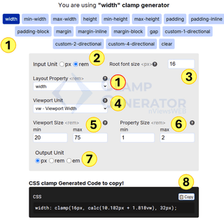
1. Property Selector
Choose the layout property you want to generate for — like width, max-width, or gap. This defines which CSS rule the clamp will be applied to.
2. Input Unit
Select whether you’re working in px or rem. By default, rem is selected for scalable and accessible design systems.
3. Root Font Size
Set your root font size for rem-based conversion. Default is 16px, which is the typical browser base size.
4. Viewport Unit
Choose how the scaling should respond — vw (viewport width) is the default and works for most responsive layouts.
5. Viewport Size Range
Set the minimum and maximum viewport widths. The default is 20rem (320px) to 75rem (1200px).
6. Property Size Range
Define the minimum and maximum size for the selected layout property. For example, width might scale from 1rem to 2rem.
7. Output Unit
Select how you want the final clamp value to be expressed — px, rem, or em. By default, it is set to px.
8. CSS Clamp Output
After adjusting the values, the generator instantly produces a valid clamp() output like:
width: clamp(16px, calc(10.182px + 1.818vw), 32px);You can click Copy to grab it and paste directly into your CSS.
Shorthand Support for 4-Directional Properties (e.g., Padding, Margin)
Some properties like padding or margin use four-directional values (top, right, bottom, left). The generator lets you toggle shorthand behavior and configure each side individually.
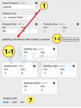
1. Layout Property Selection
When selecting padding or margin, additional input sections appear.
1-1. Shorthand Controls (Top, Right, Bottom, Left)
You can input min and max values for each side individually. For example:
padding-top: clamp(1rem, ..., 2rem)
padding-left: clamp(...)
1-2. Toggle Shorthand
Click “Disable Shorthand” if you want to switch from unified to directional control.
7. Output Unit
You can still choose px, rem, or em for each value output.
This is useful for grid layouts, spacing blocks, or cards where top and bottom spacing might differ from left and right.
Gap & Custom 2-Directional Shorthand Properties
For properties like gap, margin-inline, or custom-2-directional values (row/column or x/y), the tool offers dedicated support for dual-value shorthand.
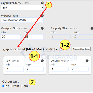
1. Layout Property
Select gap, margin-inline, or a custom shorthand property. The UI adjusts to display row/column or x/y inputs.
1-1. Row and Column Controls
Set min and max values separately for:
- Row (vertical gap)
- Column (horizontal gap)
1-2. Toggle Shorthand
You can enable or disable two-directional shorthand to control both values independently.
7. Output Unit
Choose the final output format in px, rem, or em — consistent with your project settings.
💡 Pro Tips for Using the Clamp Generator
1. ✅ Auto-Simplified Output
If your min and max values are equal, or the viewport range doesn’t change, we automatically return a clean, static value:
font-size: 16px; /* instead of clamp() */This ensures no unnecessary clamp() usage when it’s not needed — clean, performant, and semantic.
2. 🔄 Smart Handling of Reversed Values
Worried about entering min > max by mistake? or you want specific design element. For example, height property must be tall in narrow screen due to text wrap, however in the wide screen we dont need.
No problem! We do the heavy lifting. The generator intelligently swaps values if needed to respect your design intent and still outputs the correct responsive clamp():
/* Even if you enter: min = 600, max = 300 */
height: clamp(300px, calc(650px - 15.625vw), 600px);
Your input is respected. The math is corrected. The output is perfect.
Use this tool to generate layout-related clamp values just like you would for font sizes — fully responsive, fluid, and accessible by design. Combine it with your CSS, SCSS, or utility-first frameworks like Tailwind. If you need help understanding the
clamp()formula, visit ourclamp()forumla in CSS clamp guide for deeper explanation.