
Learn how to use our advanced Font Size & Typescale Clamp Generator Tool to create fully responsive, fluid font sizes with clamp() — customized by font family, weight, and scalable typescale settings. This tool is built for real-world web design projects using either CSS or Tailwind.
Below is a step-by-step visual guide with the key features explained.
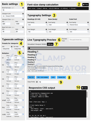
Step-by-Step Breakdown
1. Basic Settings
Let’s start by setting the basic values that define how your typography will scale across screen sizes. These settings act as the foundation for all your font size calculations.
- Root Font Size: This sets the base size for
1rem. For most projects, this is typically16px. It’s a universal value used to scale all other font sizes consistently. - Viewport Unit: Choose how the font size should scale with screen size. By default,
vw(viewport width) is selected, which means font sizes will scale based on the width of the screen. You can experiment with other units likevhor container queries in advanced layouts. - Viewport Size (Min / Max): This defines the responsive range — the smallest and largest screen widths your typography should adapt to. By default, the range is from
320px(common for mobile) to1280px(typical desktop width). - Base Font Size (Min / Max): This determines how your body text scales. For better accessibility, we use a default range of
16pxto20px, ensuring your content remains readable on all devices.
These settings influence every clamp value you generate. Once they’re configured, the rest of the tool adapts to your project’s base typography scale.
2. Clamp Output Preview
Pro tip: If you’re not looking for advanced setup — and just need a quick
clamp()value for font size — this section gives you exactly that.
As you adjust your base font size and viewport range, the tool instantly calculates the corresponding clamp() formula. This value represents a responsive font size that fluidly scales between your defined minimum and maximum, depending on the screen width.
For example:
font-size: clamp(1.00rem, calc(0.909rem + 0.455vw), 1.25rem);In this case, the font size starts at 16px on smaller screens and gradually increases up to 20px on larger screens (based on a 320px - 1200px viewport range).
You can copy this value directly and use it in your CSS or design system — perfect for a quick, one-off font size setup.
3. Typography Settings
This section allows you to choose the font family and font weight for three primary groups of elements:
- Headings (H1-H6)
- Body text
- Code (monospaced font)
You can select any font available from Google Fonts, such as Inter, Roboto Mono, or others.
Each group also supports custom font weights (depending on the font) — ranging from 100 (Thin Light) to 900 (Extra Bold).
Typography Defaults:
- Headings:
Inter, weight700 - Body:
Inter, weight400 - Code:
Roboto Mono, weight400
When you change a font or weight setting, the live preview updates instantly across all elements — so you can immediately see how your typography looks in action.
4. Typescale Presets
Instead of manually defining font size ratios, you can select a typescale preset to quickly apply a consistent hierarchy. Presets include:
- Default Min / Max
- Comfortable Min / Max
- Minor Third
- Major Fourth
- Perfect Fourth
- Golden Ratio
These presets adjust the scaling multiplier for each element based on common typographic systems. You can mix and match presets for minimum and maximum to fine-tune your design.
5. Manual Multipliers
For full control, you can manually adjust the min and max multipliers for each text element — from H1 to H6, as well as small, tiny, and code.
For example:
- H1 might scale from 1.8x to 2.5x the base font size
- H6 might scale from 1.1x to 1.3x
This helps you create a completely custom typescale system that fits your brand or UI needs.
6. Live Preview Text
You can update the sample preview text to better reflect your actual content. Whether it’s a heading, tagline, or paragraph — just type in your own text and see how it scales across the typography system.
This helps you evaluate the legibility and tone of your font choices in a real-world context.
7. Simulated Viewport Slider
Use the slider to simulate different screen widths — from mobile to desktop. As you slide between values (e.g., 320px to 1280px), all text elements update dynamically, showing how their sizes change using the clamp() formula.
This is useful for testing the responsiveness of your typescale visually without writing any code.
8. Output Format Options
Once you’re satisfied with your settings, choose how you want to copy the generated styles. You can switch between:
- Plain CSS
- CSS with root and variables
- SCSS
- Tailwind CSS utility classes
This flexibility allows you to use the generator in almost any tech stack or workflow.
9. Class Prefix
To avoid class name conflicts in large projects, you can set a custom prefix (like cg-) for the generated utility classes. This is especially useful if you’re copying Tailwind-style output or integrating with an existing design system.
10. Responsive CSS Output
This is your final, fully responsive CSS code. It includes everything from root font size to font families, weights, clamp() values for headings and text, and your selected format.
Click the copy button and paste it directly into your project — it’s ready to go.