Fluid Layout Techniques
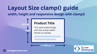
Use CSS clamp() to adapt layout elements responsively.
Start exploring clamp() generator & tools to enhance your responsive design workflow!
Use CSS clamp() to adapt layout elements responsively.
Start exploring clamp() generator & tools to enhance your responsive design workflow!